MAYA
Designing From Scratch
Resuming work on a device that I created in my Junior year capstone engineering course, I repurposed my sexual assault device to be a deterrent for assault of any kind. Instead of focusing on the small percentage of violent assaults in which the victim is suddenly attacked, where a solution like the iPhone emergency SOS function might be more effective, MAYA aims to deter 80% of assaults that are suddenly instigated by someone that the victim knows.
Date
Oct 2020 - Jan 2021
My Role
UI/UX Designer & UX Researcher
Tools
Figma, Adobe XD, Procreate, Miro, Photoshop
Team
Maxine Tam

USER PRIORITIES
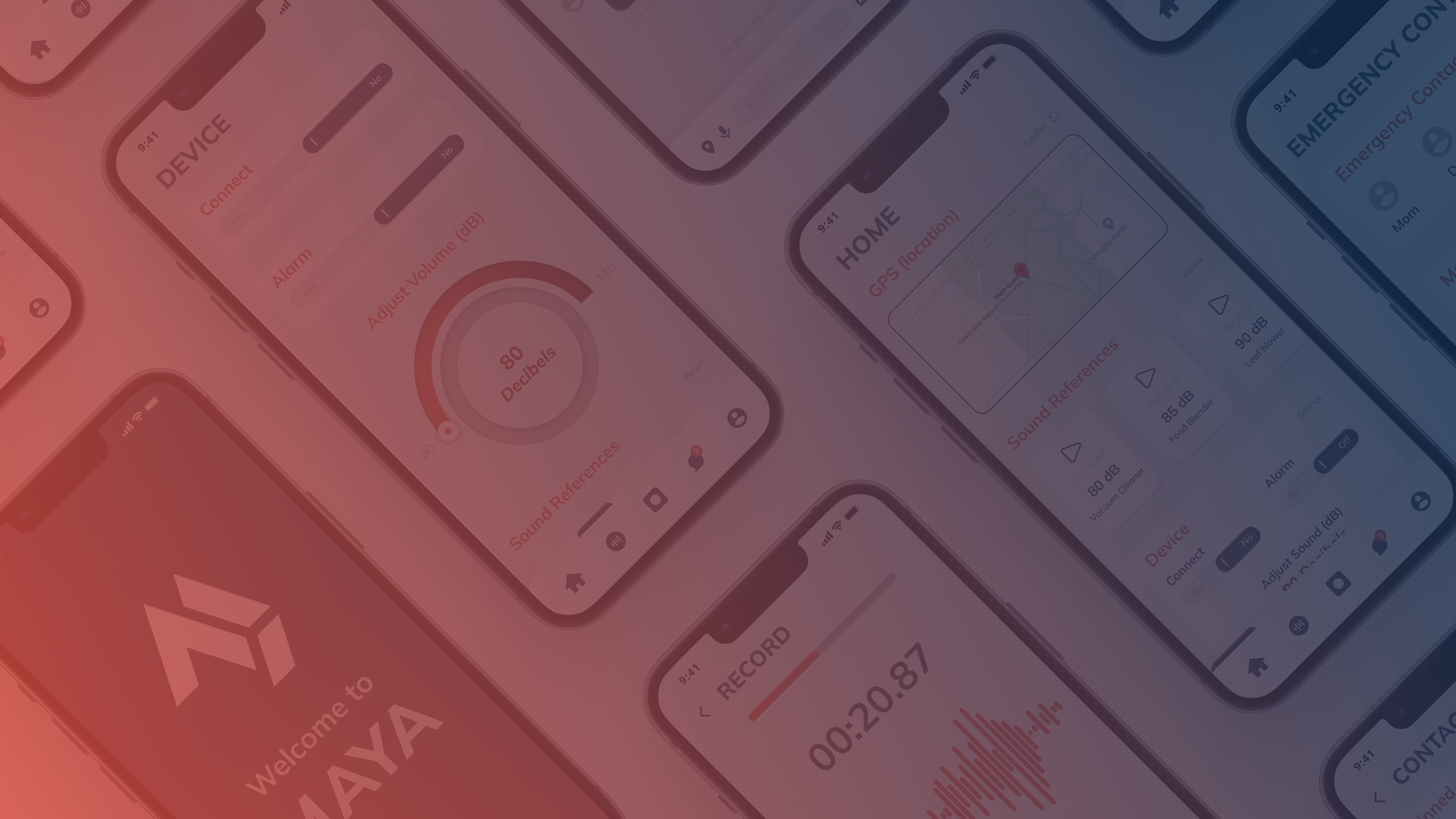
I designed the home page to be the most timely and efficient pages, with the summary of all the applications. Based on user feedback, I identified “Safety Recordings” as the the most valuable feature on the Home page. Thus, I presented it in the middle of the screen to be the most optimal and easy position for ones finger to press on. With MAYA’s algorithm, the most used recordings would be placed on the Home screen.
ONBOARDING + HOME
SHIELD OF VOICES IN UNCERTAIN MOMENTS
The app enables users to access “safety recordings” – pre-recorded conversations – such as phone calls, FaceTimes, and more. Doing so would give users an excuse to excuse themselves from and diffuse an otherwise risky situation without having to escalate the encounter. Users may search through both their self customized sounds as well as from MAYA’s diverse sound/video database. Users may create their own personal sounds, videos, and voice recordings with 3 simple steps!
SAFETY RECORDINGS

SAFTEY AT YOUR FINGERTIPS
With the device connecting to the app via bluetooth, users may easily disconnect the device at any given time. Users may also adjust the device’s alarm volume to their preferences via the dial. As an extra visual cue, the numeric decibel displayed and dial would change hues based on the volume level. Furthermore, the sound references act as an aid in making appropriate volume adjustments, with familiar sounds labeling each decibel level.
DEVICE
SOS AT A PUSH OF A BUTTON
In the event that the situation has escalated and the users are unable to reach their phones, pressing the device’s button once will begin a voice/video recording from the phone and send a pre-written, customizable, SOS message to the user's emergency contacts. Pressing it twice will trigger the same actions plus set off the device’s alarm and send the user’s GPS location to both the emergency contacts and the nearest police station.
CONTACTS + MESSAGING

YOUR WORLD, YOUR WAY
Within their user account, individuals have the convenient ability to personalize and tailor the settings for both their app and MAYA device, ensuring a customized experience.
ACCOUNT
RESEARCH & IDEATION
CONTEXT
Assault such as sexual violence transcends societal boundaries and inflicts its devastating impact on individuals from all walks of life, regardless of social class.
PROBLEM
“463,634 victims (age 12 or older) of rape and sexual assault each year in the United States. . . 1 in 6 women and 1 in 33 men are victims of attempted or completed rape.”
- RAINN
Sexual violence exerts a far-reaching impact on entire communities and societies, extending beyond its immediate toll on survivors and their loved ones. It is the collective duty of society to confront, deter, and prevent these acts of assault. With this commitment in mind, I recognized the importance of advancing this project. The device was initially conceived to seamlessly integrate with mobile phones and its contact list, motivating me to augment its potential by introducing a dedicated app.

HOW MIGHT I...
create an app that not only effectively serves the needs of users in emergency situations but also seamlessly integrates with the MAYA physical device?
OPPORTUNITY
With approximately 15 million mobile devices in operation worldwide, a vast opportunity presented itself for me to integrate MAYA with the most ubiquitous device - the mobile phone. In doing so, I could harness its features to my advantage. These devices come equipped with a multitude of functionalities like GPS, alert sounds, and more, all readily accessible in case of an emergency. The presence of built-in tracking services in mobile devices also facilitated the creation of a smaller and more inconspicuous iteration of MAYA, aligning perfectly with our goal.
INTEGRATING WITH EXISTING TECHNOLOGY
→
MAYA - The physical device was created during my junior year as part of a high school capstone engineering course

GOALS
My mission is to craft a user-friendly product that not only empowers victims and survivors but also restores a sense of control to those who rely on the product. I aim to make the user experience seamless and intuitive, allowing individuals to navigate and utilize the product with ease and confidence.
EMPOWERING AND RESTORING CONTROL
INDUSTRY RESEARCH
I evaluate the leading four technology-based sexual assault deterrent and “prevention” devices, with a primary focus on essential features such as emergency contact functionality, SOS messaging capabilities, alert systems, user accessibility, and app integration. Upon an analysis of these products, it became evident that each device exhibited a high level of sophistication and innovation. Nevertheless, a common shortcoming across all of them was the absence of integration with the most ubiquitous and accessible tool available: the mobile phone.
COMPETITIVE ANALYSIS

MAPPING THE PROBLEM SPACE
To gain a deeper understanding of the problem space and keep a sharp focus on my objectives, I created a mind map. This visual representation encapsulated intricate patterns and discerning notes derived from the exploration of various resources, including videos, blogs, news reports, and a plethora of external sources. This integration of real-life experiences and comprehensive research not only enriched my understanding but also served as a guide for my efforts toward addressing the most crucial facets of the challenge with precision and effectiveness.
EVALUATING AREAS TO TARGET
Click the image or here to view full mind map file
UNDERSTANDING USERS
Drawing upon my extensive research, I carefully crafted two distinct personas. These personas proved instrumental in guiding and prioritizing my design decisions, ensuring that the needs and experiences of the end users remained at the forefront of the entire design process.
PERSONAS

UNDERSTANDING USERS (CONT.)
SCENARIO MAPPING
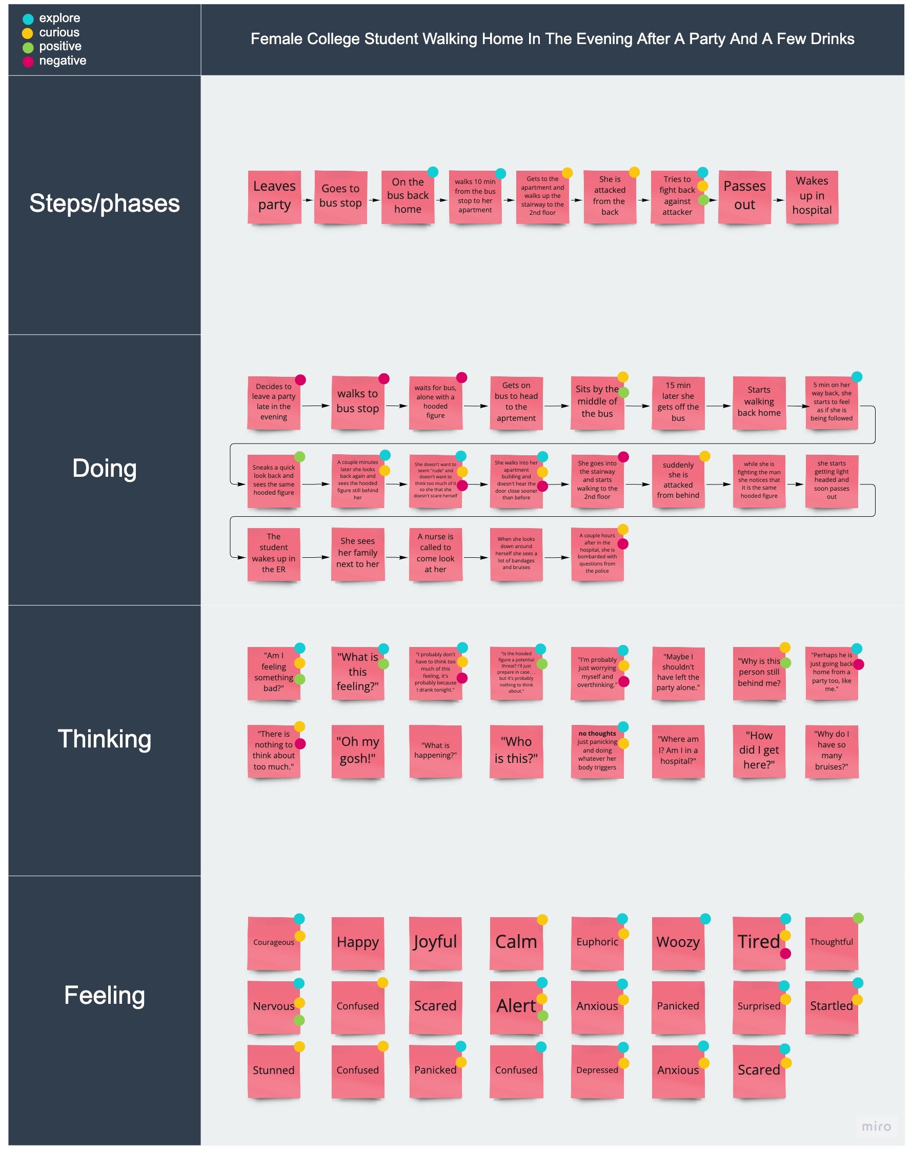
I conducted an scenario mapping exercise that revolved around a situation in which a tipsy female college student opted to return home alone following a party. This task served a dual purpose: not only did it enable me to pinpoint opportunities for improvement, but it also deepened my comprehension of the needs and experiences of my potential user base.
As I documented my findings, I consciously marked points within the scenario where my curiosity was piqued, areas I wished to delve into more deeply, and instances that triggered both positive and negative reactions. This method of reflection and critical self-assessment allowed me to continually challenge my biases and assumptions, ensuring a more empathetic and user-centric approach in my work.
SKETCHES
I sketched multiple screens to help visualize a multitude of potential solutions, features, and characteristics that I wanted to incorporate in MAYA’s app. I have also sketched out a screen of what an emergency contact may receive when a S.O.S message has been deployed.
PRELIMINARY IDEATION

DESIGN SYSTEM
I designed the MAYA logo to be a seamless melding of both the shape of the device and the letters in the word “Maya,” creating a harmonious visual identity. To ensure uniformity and cohesion across the entire app experience, I crafted a style guide that encompasses four primary colors and employs 'Muli' as the dominant font, reinforcing a consistent and aesthetically pleasing brand image.
LOGO DESIGN
REFLECTING
LESSONS LEARNED...
INTERVIEWS
In hindsight, an important lesson I’ve learned from this project is the importance of user interviews. No matter how comprehensive my external research may be, which included studying YouTube videos, articles, and secondary user interviews, I've come to realize that the absence of direct user interviews significantly hampers the efficiency and effectiveness of the user research process.
IF I HAD MORE TIME...
USER TEST
I would like to delve deeper into researching the intricacies of conducting precise user tests, especially in situations where individuals may be confronted with heightened levels of adrenaline or shock. Through this endeavor, I aim to cultivate a heightened level of sensitivity and expertise, tailoring user tests to be finely attuned to the unique complexities of emotions and situational stress that can arise in such scenarios.
NOTABLE HIGHLIGHTS...
SELF LEARNING
Reflecting on my journey, I'm immensely grateful for the chance to have taken engineering courses. What initially started as my curiosity for engineering has since blossomed into a deep love for human-centered design. Considering that this project was my first real exposure into the world of UI/UX, and given the rapid delivery timeline, I take immense pride in how I successfully self-educated, delving into diverse design processes by leveraging resources such as YouTube videos, insightful Medium articles, LinkedIn learning courses, and so much more.


