METAMASK
Redesigning An Existing Product
My team and I re-designed a cryptocurrency software wallet, Metamask, while working closely with Professor Yang Wang from the School of Information Sciences at UIUC. We escalate over 60 screens by utilizing accessibility design to make MetaMask more user-friendly, efficient, secure, and comfortable for over 295 million people living with moderate-to-severe visual impairments.
Date
Sep 2021- Dec 2021 + July 2022 (1 month)
My Role
UX Researcher, UI/UX Designer
Tools
Figma
Team
Maxine Tam, Priya Goel, Luke Emano, Sophia Ng, Shaan Ahuja

SOLUTION
Following the conclusion of the project in December 2021, I dedicated a portion of my summer in 2022 to revisit and enhance the project. Over a month, I meticulously fine-tuned the interface with a focus on reducing cognitive overload, elevating design consistency and intentionality, and expanding user control through the introduction of both dark and light mode options.
(Light mode will be displayed at the end)

OPTIMIZING NAVIGATION & ACCESSIBILITY
WALLET (PT.1) + SETTINGS
One of the key enhancements we made was streamlining app navigation by replacing the side menu with a new bottom navigation bar, reducing the page options from 11 to just five, including a new addition.
After extensive research we affirmed the importance of the four primary action buttons - 'receive,' 'buy,' 'send,' and 'swap.' As a result, we amplified their button size to optimize accessibility.
Furthermore, we prioritized the newly-built, extensive accessibility settings, ensuring they are prominently featured within the 'Settings' menu for easy access.
ENHANCING TRANSACTIONAL CUSTOMIZATION & EFFICIENCY
WALLET (PT.2)
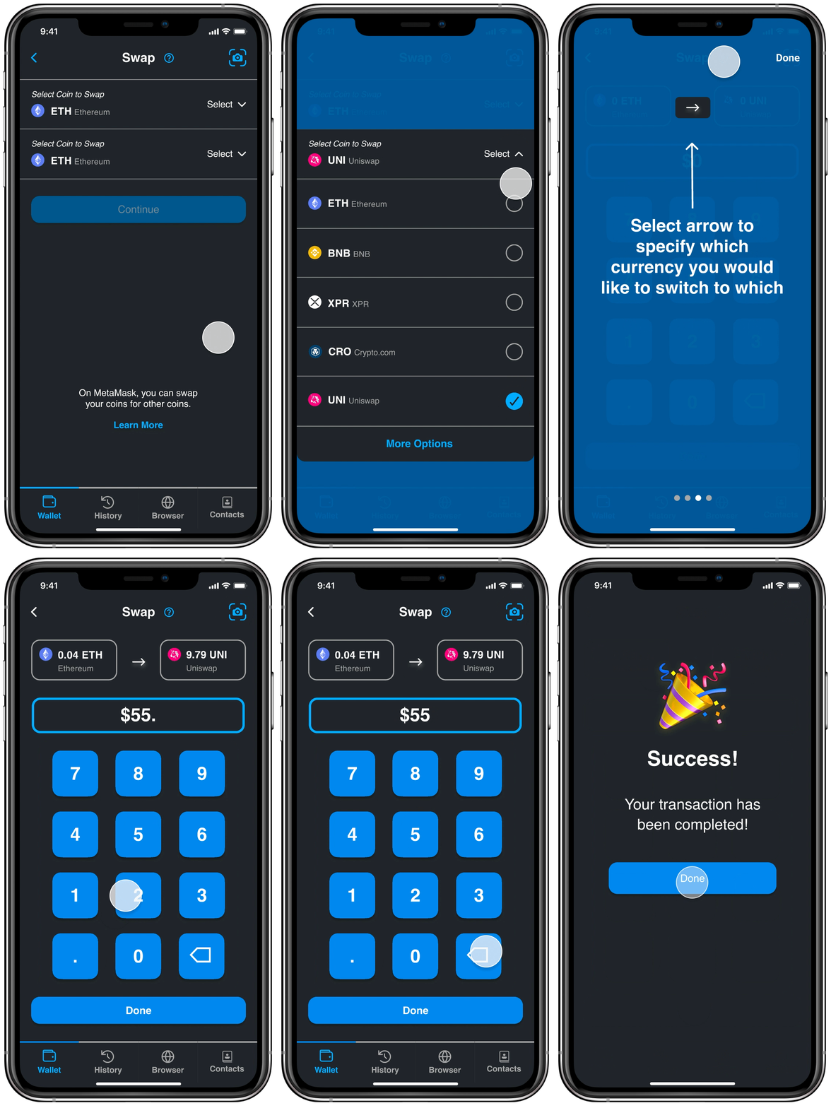
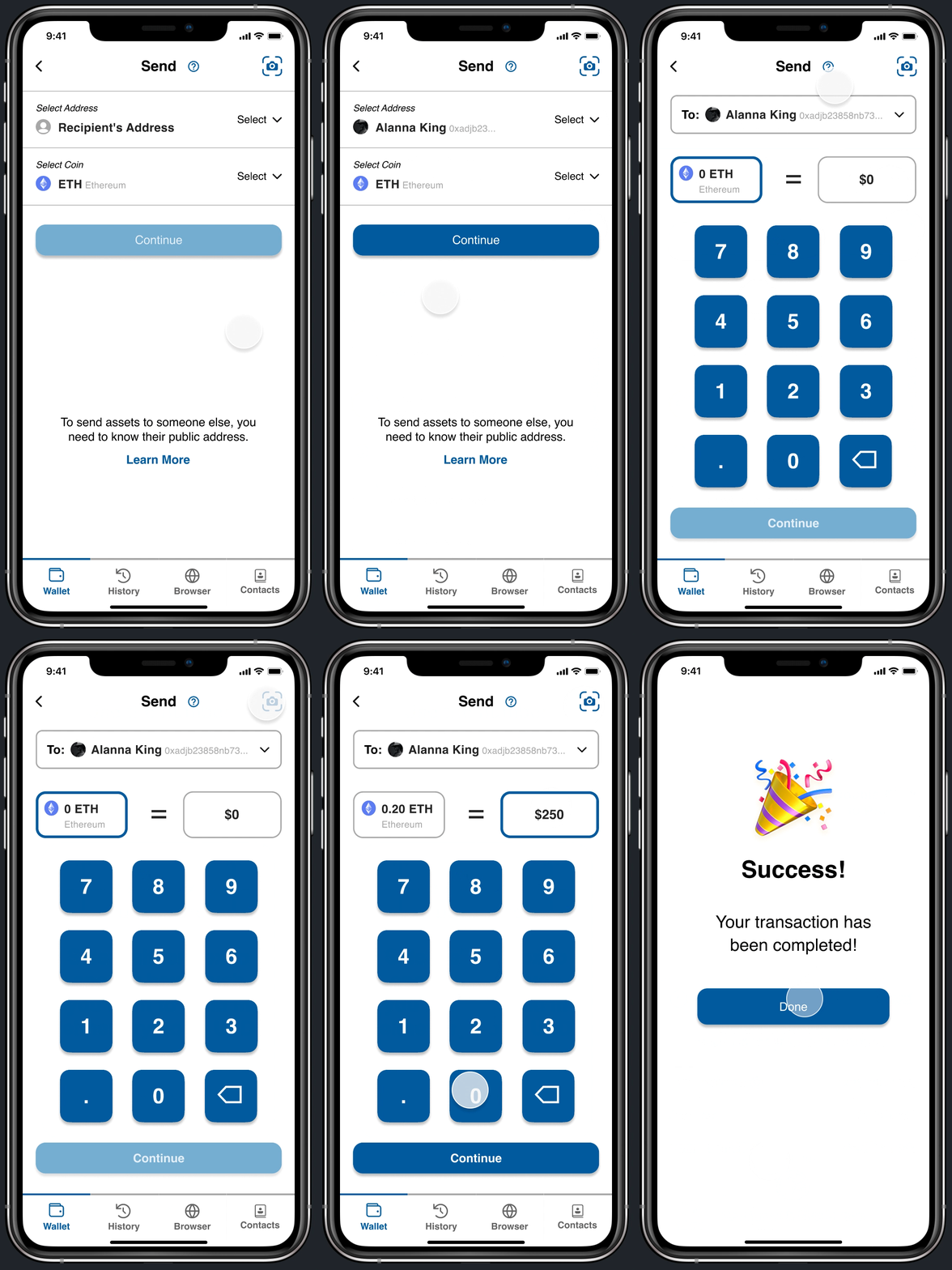
To make users’ entire transactional experience more customizable and efficient we updated the purchasing system to include the most common payment methods such as Apple Pay, PayPal, and more. In addition, to ensure an effortless adoption regardless of crypto experience, each of the 4 transactional sections has dedicated guided tours to provide users with an intuitive, personalized experience within their respective domains.
Buy crypto
Send your assets
Receive from others
Swap between coins

EMPOWERING FINANCE DECISIONS
HISTORY
In interviews, we found that both bank and crypto users highly valued a price and transfer history page. To meet this demand, I designed user-friendly screens for viewing transaction history and real-time cryptocurrency prices, featuring intuitive navigation, enabling users to make informed financial decisions swiftly. Additionally, I ensured currency display aligns with the user's location or preference, whether that be the Dollar or Euro value, promoting global accessibility.
REIMAGINING THE BROWSER
BROWSER
We redesigned the browser page to be more user-friendly and intuitive. We highlight recently viewed pages, favorites, and suggested browsing sites. These redesigned screens aim to be effortlessly straightforward, catering to novice crypto users and facilitating quick resolution of any queries. Additionally, we emphasize the decentralized web, a distinctive MetaMask feature.

STRENGTHENING USER CONNECTIONS
CONTACTS
We have introduced a dedicated contacts page to foster genuine interactions among users. This page streamlines the process of adding, viewing, and messaging others while ensuring a secure channel for communication between buyers and senders.

A BRIGHTER PERSPECTIVE
Wallet & Settings
LIGHT MODE
Buy crypto
Send your assets
Receive from others
Swap between coins
History
Browser
Contacts
RESEARCH & IDEATION
CONTEXT
While exploring the app, our team recognized the need for an even more intuitive and user-friendly user experience. Furthermore, we observed a prevalent issue in most crypto wallets, where accessibility features for users with disabilities, especially those with moderate-to-severe visual impairments, were often lacking. This inspired our mission to broaden cryptocurrency adoption, addressing the needs of the 295 million people in this demographic.
ACCESSIBILITY ISSUES

HOW MIGHT WE...
enhance the design to ensure it is universally accessible, user-friendly, efficient, and comfortable, accommodating a wide range of individuals with diverse preferences, abilities, and levels of comprehension?
INDUSTRY RESEARCH
In our evaluation, we benchmarked MetaMask against the top three Ethereum-based crypto wallets: Coinbase, Exodus, and Mew Wallet. Our comprehensive analysis encompassed security, features, user experience, and user reviews. Upon synthesizing the findings, we discerned that MetaMask scored much lower in terms of accessibility, user flow, and user reviews, while it distinguished itself with unique features, notably an in-app Browser. These insights were pivotal in shaping our future design decisions and aligning our design objectives.
COMPETITIVE ANALYSIS

RE-EVALUATING RESEARCH APPROACH
Initially, we had planned to both deploy a survey and conduct interviews based on our respondents, but we came upon a Reddit page published by a student community for those with visual impairments. This page helped correct our misconceptions and compelled us to reevaluate our approach to research and understanding process.
“This group isn’t the place to ask questions you can answer by Googling. . . Learn about the history of blindness and assistive technology. ”
- BVI Reddit Community
Instead of deploying surveys, we relied greatly on outside research and interviews. With this research, we garnered an understanding of misconceptions about BVI individuals, interactions with BVI individuals, accessibility requirements, differences between low vision, legal blindness, and total blindness, and more.
SURVEY + OUTSIDE RESEARCH

UNDERSTANDING USERS
We conducted interviews with over 30 users with varied experiences and proficiencies with banking and cryptocurrency applications. Throughout these interviews, we observed users as they engaged in both routine and assigned tasks using both Metamask and their preferred banking or cryptocurrency app. In parallel with their actions, users verbally shared their actions, thoughts, and emotional responses. This data not only deepened our understanding of user behavior but also helped pinpoint the distinctive features and attributes of the applications that evoked frustration or proved to be particularly successful.
INTERVIEWS
We created a total of 8 different user personas with varying crypto experiences and visual fields based on the current MetaMask interface.
We created a total of 8 different user flows with varying crypto experiences and visual fields based on the current MetaMask interface and the redesigned interface.
AFFINITY MAPPING
After understanding our users’ expectations, frustrations, goals, and motivations, we categorized features and elements into 3 main categories: will not have, could have, and must have.
MAKING SENSE OF USER RESEARCH

SKETCHES
To articulate and synthesize ideas for the different element of the application, I illustrated multiple screens. These sketches served as a crucial bridge, significantly streamlining and simplifying the process of translating concepts digitally.
PRELIMINARY IDEATION

DESIGN SYSTEM
To make our design accessible to all users, we designed with focus on typography (text size & font), line length, spacing, and brightness and color contrast, all according to the Web Content Accessibility Guidelines (WCAG)
ACCESSIBILITY ENHANCEMENTS
Dark mode style guide
Light mode style guide

LOW-FIDELITY WIREFRAMES
Our redesign was informed by our interviews with current banking and crypto users, revealing recurring wants and needs that we ensured to integrate into our initial digital designs to alleviate any frustrations and pain points. Our primary focus was on simplifying the crypto transaction process to minimize confusion, especially concerning crypto conversions. In this endeavor, we drew inspiration from successful banking apps like Venmo, leveraging similar design principles to create a more user-centric experience.
INITIAL IDEATION
REFLECTING
LESSONS LEARNED...
DESIGN SYSTEM
When progressing from low-fidelity to high-fidelity screens, my design leads had not provided us with a design system. At that point, I was still in the process of grasping just how crucial a design system can be in the design workflow. Consequently, when it came time to lay out the functionalities, it necessitated twice the effort to revisit the designs and make them cohesively blend five different designers' inputs. Despite our efforts, visible discrepancies remained. This experience served as a valuable lesson, prompting me to understand the significance of establishing a clear design system from the beginning of any design project. Subsequently, I made it a point to strictly adhere to a well-defined design system for my redesigns, ensuring a efficient and streamlined design process.
IF I HAD MORE TIME...
USER TEST
I would like to have conducted a two-phase user testing approach. This would have entailed initial user testing on the original product developed with my team, followed by a second round of testing on the redesign I individually created. This approach would have been beneficial in garnering an understanding of the design's evolution and user satisfaction. In the first phase, the user testing of the initial product would have provided essential insights into its usability, uncovering pain points, and yielding user feedback crucial for guiding refinements and enhancements. Subsequently, the second phase of user testing on my redesign would have served to evaluate the effectiveness of the improvements made based on the initial testing. By integrating both phases of user testing into the project, we could have been confident that the final design was not only user-friendly but also a substantial improvement over the original product, ensuring that it closely aligned with the specific needs and preferences of our target users.
NOTABLE HIGHLIGHTS...
TEAM
Looking back, as this marked my first venture into UI/UX, I’m immensely grateful for the invaluable opportunity to collaborate with a diverse team. This project served as a pivotal learning experience for me, allowing me to glean insights and knowledge from a multitude of talented individuals hailing from various disciplines, including experienced designers, business professionals, and engineers.
ACCESSIBILITY DESIGN
Despite extensive research on the BVI community, I acknowledge that there are still numerous unexplored experiences and perspectives I wish I could have delved further into given additional time. Driven by my enduring passion for social equity, I aspire to continue learning about accessibility design to evolve into a more inclusive designer and innovator, capable of creating solutions for a diverse audience.


