SIEBEL CENTER FOR DESIGN(SCD)
Designing From Scratch
Following an in-depth dive into human-centered user research last summer, which played a pivotal role in laying the groundwork for my prototyping efforts, I am currently creating a tailored, immersive, and explorative self-touring app experience for 20,000-plus new visitors that SCD welcomes annually. As these visitors traverse the different spaces within SCD, my primary goal with the app is to provide a seamless and enriching journey, amplifying their understanding of the various use cases associated with each space. Furthermore, with my work I aim to ensure significant improvement for information retention compared to traditional touring methods.
In the works right now!
Date
June 2023 - Present
My Role
Media, Design, and Communication Intern
Tools
Figma and Figjam
Team
Maxine Tam and Sarah Anderson

ENHANCING VISITOR EXPERIENCE
The need for a more immersive and interactive approach to facilitate better information retention became evident after garnering feedback from visitors. The conventional practice of addressing a group while strolling through SCD proved inadequate due to its limitations in effectively communicating the diverse aspects of the center tailored to the needs and interests of the 20,000-plus annual visitors. Furthermore, this lack of personalization impeded visitors' capacity to recall the details of the spaces explored.
Recognizing the evolving expectations of a diverse audience and understanding the need for a more interactive process, the project emerged as a transformative solution to bridge these gaps and elevate the overall visitor experience.
EXISTING PROBLEM & CHALLENGES
CURRENT INDUSTRY METHODS
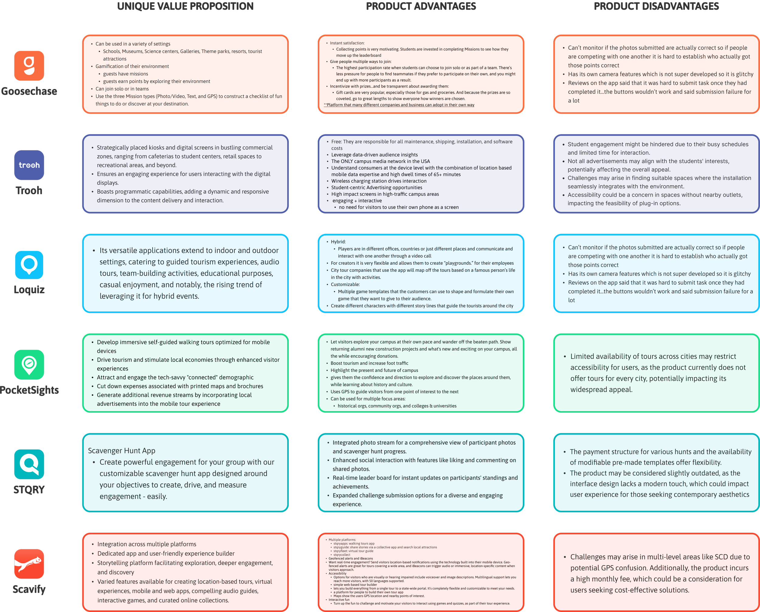
To delve deeper into understanding effective touring practices, we examined the top 6 self-touring technologies: Goosechase, Trooh, Logquiz, PocketSights, Scavify, and STQRY. Our extensive research involved a thorough analysis of each product, comparing and contrasting them to unveil distinctive features, and comprehensively assessing their respective strengths and weaknesses.
COMPETITIVE ANALYSIS

SYNTHESIZING FINDINGS
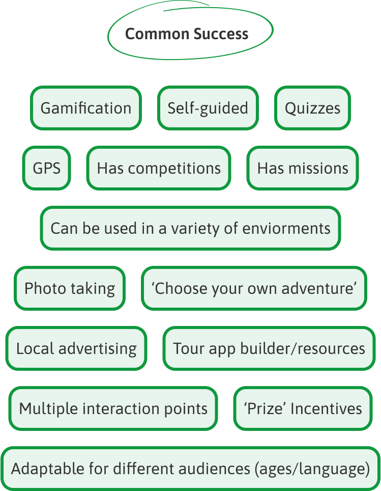
Upon compiling detailed notes for each product, we meticulously pinpointed the common success factors shared across all platforms. Additionally, we extracted invaluable lessons, identifying elements to avoid and those we sought to integrate into the design prototypes we were crafting. Subsequently, we synthesized these insights to map out various opportunities, aligning our goals with the diverse possibilities identified during this comprehensive analysis.
DISCOVERING EXPERIENCES
COMPETITIVE ANALYSIS
We interviewed 15 participants, including high school prospective students, SCD student staff and full-time staff in charge of tours, and UIUC general students with varying levels of familiarity with SCD. We aimed to understand their first experiences, preferences, and support needs during their initial visit. In particular, our discussions with SCD staff members extended to exploring current methods, highlighting successes and challenges, and uncovering common user behaviors and emotions associated with the current touring methods.
LEARNING OBJECTIVES

UNDERSTANDING CONVERSATIONS
We systematically categorizing statements, observations, and general notes into coherent patterns, providing a structured framework for our analysis. Through this methodical approach, we organized our findings to gain a comprehensive understanding. We uncovered 8 distinct areas of observation, with an additional miscellaneous group, offering nuanced insights into various facets of user experiences:
AFFINITY MAPPING - CARD SORTING
AREAS FOR EXPLORATION
Drawing from user interviews and competitive analysis, we identified opportunities to strategically position our new product, addressing gaps in the industry and enhancing SCD's touring methods. Our goal was to elevate the overall user experience, leading us to create four tailored statements for main user personas. Synthesizing these perspectives, we formed a cohesive, goal-oriented statement guiding our design aspirations for a holistic approach to user satisfaction.
OPPORTUNITIES & USERS

HOW MIGHT WE...
elevate the user experience during tours by integrating innovative ideas and interactive elements, ensuring seamless navigation, personalized content delivery, and fostering deeper engagement with SCD?
VISUALIZING USERS
PERSONAS & JOURNEY MAPS
To deepen my comprehension of SCD's visitors and our user base, we meticulously crafted personas for our four primary user segments. Concurrently, we embarked on the creation of user journeys to chart their experiences and emotions across various touring processes. This strategic approach allowed us to not only delineate pain points and frustrations but also solidify them, providing a foundation for resolving these issues with the proposed solutions.

PRODUCT GOALS
PAIN POINTS
Leveraging my insights into SCD’s users’ behavior, I defined specific objectives for my product. These goals were carefully crafted to effectively address the most common pain points and frustrations identified through extensive research.

FEATURE IDEATION
AFFINITY MPPING
Through an extensive brainstorming session, we identified and categorized over 30 features into three distinct groups: essential must-haves, potential additions, and unnecessary elements. This methodical approach proved pivotal in crafting the foundational framework for our product ideation.
We meticulously designed and organized the screens deemed essential to the overall touring experience at SCD, rooted in insights from user research, ensuring a purposeful and user-centric design layout.
INFO ARCHITECTURE
BLUEPRINT FOR EXPERIENCES

VISUALIZING
SKETCHES
Being a very visual designer, I translated my envisioned experiences into sketches. I transitioned straight from sketches to first round of high-fidelity prototypes by placing a strong emphasis on a rapid prototyping process in order to extract maximum insights from numerous user testing sessions.
PREPARATION
USER TESTING
In preparation for my user testing, I spent an entire day closely observing the body flow from different entrances and diligently counting the number of visitors from each one to pinpoint the most accessible and commonly used entrance, forming the most logical starting point for my in-SCD testing.
I conducted additional research by mapping out the most popular points on campus using Google Maps and tracing the route back to SCD. Regardless of the direction, Google Maps consistently directed users to a specific entrance.

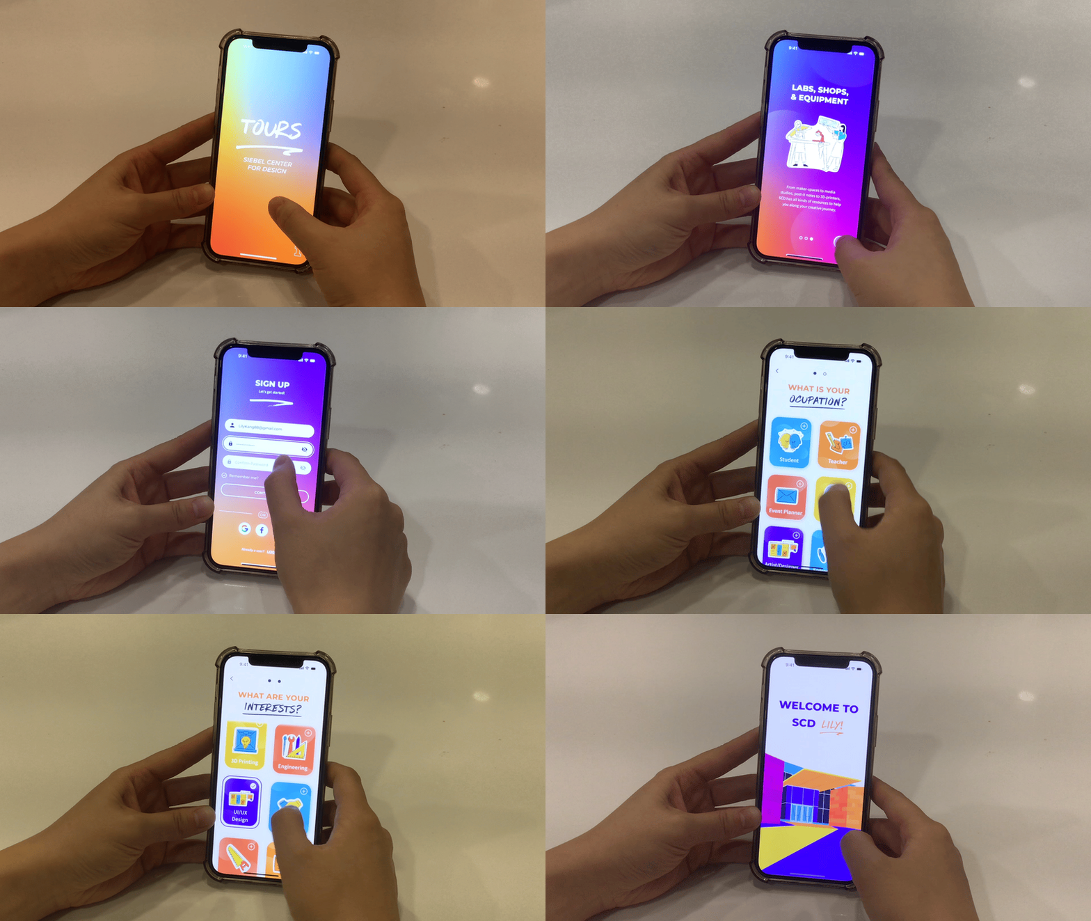
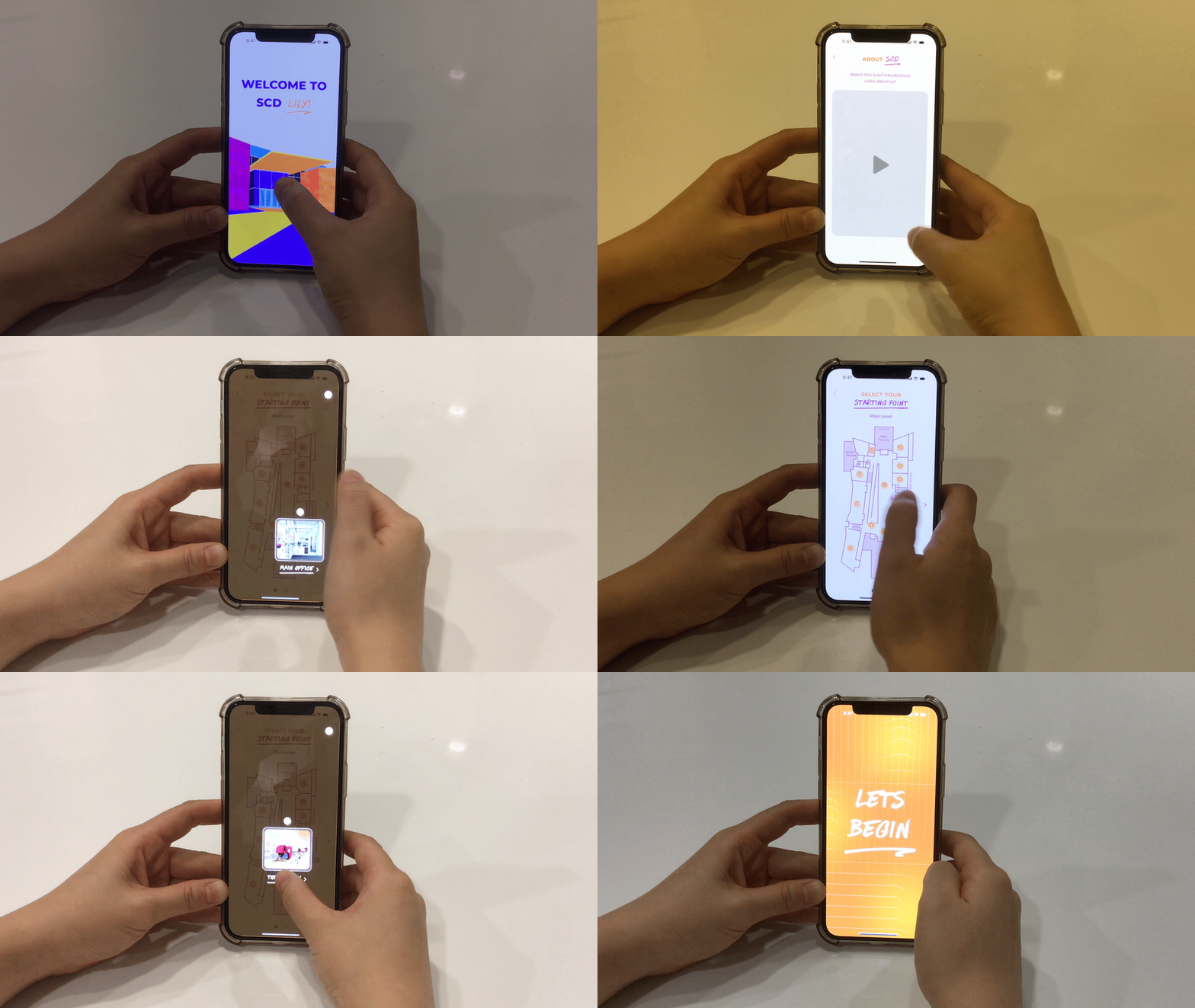
Before initiating the in-SCD testing, I set the stage by asking participants to envision encountering a sign encouraging them to download the SCD app to explore the resources and opportunities within the building. Once participants grasped this scenario, I handed them my phone with the prototype ready for exploration! Adopting a hands-off approach during the walkthrough, I refrained from intervening in participants' interactions with the prototype.
USER TESTING
SETTING THE STAGE

Conducting three distinct rounds of in-person user testing, I gathered valuable feedback from a diverse group of 14 users. I conducted 8 tests within SCD and 6 tests outside its premises. This dual approach allowed me to evaluate both self-touring experiences for users exploring SCD within the building and those discovering it remotely.
USER TESTING
USER FEEDBACK


